It just recently occurs to me that I have a lot of difficulties in learning under this program. I am not sure if it is just because this is a distance learning program. To be honest, I prefer working independently, so less interaction with people actually works better for me. However, when I have question, where should I turn to.
The first day when I sign up for this course, I got warned (by OCA staff) on the forum that we cannot bother our tutor on every tiny question. The interesting part is then somebody put up a post saying that his wife quitted her degree in anger, because her tutor told her that he only get paid for grading the assignment, not the exercises. I don't know if I am "lucky" to run into all those posts just at the beginning of the course, but I always feel that I should not ask too much question but think more myself.
I don't have a problem with that, but what if I do need some moral guidance? It is sort of silly to ask, but is this blog setup ok? Can anyone navigate around here? By the way, is there anyone reading my post? To be honest, no one ever commented on my exercise, so I assume they are fine. Sometime (I think) I get what the exercise for, sometime I don't, but I just let it be. No one ever said I did something wrong, so it is a "good assumption" that it all goes perfectly. I have a feeling, that I won't hear anything about this until the assessment day, when somebody has to (hopefully) look at everything I do and comment on it.
By then it is too late to do anything to improve.
It is the reason why I set up Spiral Labyrinth, the blog of my side project and my main blog, that I can mess around without any of the OCA stuff on it.
Anyway, why I am writing about this? I have officially passed midway of the course. As a reflection, I have to face all the short comings in studying in OCA, and find a way to work around it. The OCA course note on Colour (previous section) and Light (current section) are too limited. It is not possible to get even the basic understanding just by reading and doing the exercise there. There is a reading list. However, at this stage, they are not just recommended reading materials, but necessary reading materials.
I have some doubt if a degree in Photography is what I seek. I feel the current syllabus in this BA in Photography is not sufficient for me. I think I will have a better idea when I get closer to the end of this course on if I should consider the BA in creative art instead.
Last but not the least, I have a quick read from the degree handbook. It gives and idea on what we are aiming for at each level. In summary:
At Level 4:
1) Learn to study independently, set goals, manage your own workload effectively, and meet deadlines
2) Develop and ability to identify, present, interpret and research works of art
3) Learn to problem solve in relation to the processes and execution of your chosen disciplines and communicate creative ideas effectively
4) Experiment, explore, and take risks.
I think I have no problem in #1 and #4. Whether I know what is art and what is work of art is an issue. I am constantly presented with images, with many of them seriously shit, even if they manage to make it into a museum. #3 is more about execution, ie operating photographic equipment and doing post processing, I think I need more practice.
Interesting enough, there is something for level 5 and 6 as well:
At Level 5:
1) Develop your individual research methodologies to find the material for assignments.
2) Cultivate working routines from which an independent style will evolve
3) Develop proficiency in comprehensive range of practices and techniques
4) Show a creative, critically informed and self-reflective approach to creative art practice
At leve 6:
1) Understanding of the professional considerations ... including an understanding of the vocational context... personal intiative and responsibility and decision making in challenging contexts
2) Aware of the social, political and economic issues which affect your chosen discipline
3) Demonstrate and underpinning understanding of theory and concepts and show that you can articulate and comment upon through debate.
4) Demonstrate a breadth of inventiveness, idea generation and techniques in the creation of your work.
Monday, 4 June 2012

Friday, 1 June 2012
Oil by Burtynsky
God, I wish that I have the time to write about the study day I have been to. This is from last week OCA study day to the Photographer Gallery. If I have time, I will write more about this exhibition some day. I am not writing it all out in one shot. However, there is one thing I want to mention: atmosphere as it presented to the audiences.
The exhibition took place in two floors.
The upper one focus on the structures that are used to drill oil , as well as the advancement (car, highway) the oil bring. The wall of this floor is painted in white and the room overall is brighter amd airy.
The lower floor focus on the aftermath: the destruction on land dur to drilling in Baku, the pile of tires, the graveyard of air planes, oil filters, helicropter. Then there is picture of oil spill and fire. The wall of this floor is painted in grey and thevmood is sufficiently darker.
Whatever the work is, the exhibitor have setup the room in a such way that the lower floor is gloomy. It might be because the aftermath of oil drilling is gloomy, but we don't exactly figure that out: the exhibitor guided us there. Although there is no personal commentary from Burtynsky, it is quite clear what he had in mind.
Most of the photographs are taken during overcast day, early morning or late at night. As a result, the colour looks slightly washed off. There are only two pictures in the whole exhibition are taken in bright daylight where the colour is most saturated. In another word, most of the shots that are tken in an overcast day or near sun rise and sunset, look quite gloomy, or banal. The only two image that is taken in bright day light is the drilling platform fire, and the oil spill. The oil spill image looks the most confusing among all the images because it looks beautiful. If not by reading the description, you won't notice this is actually an oil spill.
I have not got to the photographic content, background and history yet, but the intention is clear. You don't even need to shoot anything, the setup and presentation already set the tone.
The exhibition took place in two floors.
The upper one focus on the structures that are used to drill oil , as well as the advancement (car, highway) the oil bring. The wall of this floor is painted in white and the room overall is brighter amd airy.
The lower floor focus on the aftermath: the destruction on land dur to drilling in Baku, the pile of tires, the graveyard of air planes, oil filters, helicropter. Then there is picture of oil spill and fire. The wall of this floor is painted in grey and thevmood is sufficiently darker.
Whatever the work is, the exhibitor have setup the room in a such way that the lower floor is gloomy. It might be because the aftermath of oil drilling is gloomy, but we don't exactly figure that out: the exhibitor guided us there. Although there is no personal commentary from Burtynsky, it is quite clear what he had in mind.
Most of the photographs are taken during overcast day, early morning or late at night. As a result, the colour looks slightly washed off. There are only two pictures in the whole exhibition are taken in bright daylight where the colour is most saturated. In another word, most of the shots that are tken in an overcast day or near sun rise and sunset, look quite gloomy, or banal. The only two image that is taken in bright day light is the drilling platform fire, and the oil spill. The oil spill image looks the most confusing among all the images because it looks beautiful. If not by reading the description, you won't notice this is actually an oil spill.
I have not got to the photographic content, background and history yet, but the intention is clear. You don't even need to shoot anything, the setup and presentation already set the tone.
Thursday, 31 May 2012
Assignment 3 Re: The Churches in the City
Although personally I consider this as unfinished work, I really glad that I can send off the my tutor. There are several reasons why I am sending it off. First of all, the deadline is this Saturday. I think someone in the forum once made a comment saying that we should respect deadline, because in read world, we cannot always ask our client to extend the deadline. I think it is a fair point. At the end, we always have things we want to explore further. A deadline works well here because it forces me to gather whatever is the best I have on hand and make a decision on how I can put limited amount of resources (or result) together.
Secondly, while I find this project very interesting, I don't think the correlation with colour is that strong. For purely satisfying the requirement of the assignment, I think the submission I made on March 15th is better. I do want to continue to work on it as a personal project, but I think there is limited purpose for it to live in OCA space. In fact, when I put the presentation together, I think it will be less bulky if I don't put all the images on it.
I put the presentation here. To view it with Adobe reader, you have to go to view -> Page display -> Two up
https://docs.google.com/open?id=0B9vxityaDZ2WVmpIbm1ibjhieFE
Colour wise, it is not as a successful piece. By that, I mean colour is not the main attraction on these series of images. I have trouble deploying Johanne Itten's theory, as it is still not as intuitive to me yet. It could be personally I cannot feel what colour appeal to other people. Since some of these combinations do not appeal to me, I just cannot understand why this combination means this, so I am almost like blind trying to visualize something someone else tells me.
Hopefully this is just temporary, because in design and advertising, it is very important that I am fluent in this language.
Secondly, while I find this project very interesting, I don't think the correlation with colour is that strong. For purely satisfying the requirement of the assignment, I think the submission I made on March 15th is better. I do want to continue to work on it as a personal project, but I think there is limited purpose for it to live in OCA space. In fact, when I put the presentation together, I think it will be less bulky if I don't put all the images on it.
I put the presentation here. To view it with Adobe reader, you have to go to view -> Page display -> Two up
https://docs.google.com/open?id=0B9vxityaDZ2WVmpIbm1ibjhieFE
Colour wise, it is not as a successful piece. By that, I mean colour is not the main attraction on these series of images. I have trouble deploying Johanne Itten's theory, as it is still not as intuitive to me yet. It could be personally I cannot feel what colour appeal to other people. Since some of these combinations do not appeal to me, I just cannot understand why this combination means this, so I am almost like blind trying to visualize something someone else tells me.
Hopefully this is just temporary, because in design and advertising, it is very important that I am fluent in this language.
Sunday, 27 May 2012
Johannes Itten: The Elements of Colour
This is a book of just 100 pages but it is a very exhausting book to read. Itten wrote another book called "The Art of Colour". It was on "sale" in Amazon for GBP 1600. Yes it is almost two thousands quid. The used copy is over 300 quid, so I settled with the shorten version of it, which is "The Element of Colour".
Even as a shorten version, it takes a long time to get through a page. It is because as he suggests something, I have to go back and see if I agree. There are some colour charts on each chapter illustrates the ideas (or trying to). Then you have to look and see if you feel the way the author describes.
Most of the time, I don't.
Well, if this is the case, why bother to take time and read this book? In one of the chapter, Itten said that his students disagree with his theory of colour harmony, so he let his students to paint the way appeal to them. Each students ended with very different combination. Then he said, "the colour combination here represent individual subjective opinion. This is subject colour"
It is easy for me to tell what colour combination appeal me personally. However, if I were to work on an advertising champaign, or interior design. I need to know what appeal to my client. This is very difficult for me to grasp. Because I can't sense or feel what other people feel when they saw a colour combination. Maybe it looks horrible to me, but my client likes it.
Honestly, I am not ready to comment on how effective on the seven kinds of colour contrast and how I can use them in photography. I think unless I have a chance to set up a design with those principles in mind, it won't ever make sense. I think a still-life set up will be very effective in this area.
I will defer the discussion to assignment 4.
Even as a shorten version, it takes a long time to get through a page. It is because as he suggests something, I have to go back and see if I agree. There are some colour charts on each chapter illustrates the ideas (or trying to). Then you have to look and see if you feel the way the author describes.
Most of the time, I don't.
Well, if this is the case, why bother to take time and read this book? In one of the chapter, Itten said that his students disagree with his theory of colour harmony, so he let his students to paint the way appeal to them. Each students ended with very different combination. Then he said, "the colour combination here represent individual subjective opinion. This is subject colour"
It is easy for me to tell what colour combination appeal me personally. However, if I were to work on an advertising champaign, or interior design. I need to know what appeal to my client. This is very difficult for me to grasp. Because I can't sense or feel what other people feel when they saw a colour combination. Maybe it looks horrible to me, but my client likes it.
Honestly, I am not ready to comment on how effective on the seven kinds of colour contrast and how I can use them in photography. I think unless I have a chance to set up a design with those principles in mind, it won't ever make sense. I think a still-life set up will be very effective in this area.
I will defer the discussion to assignment 4.
Saturday, 19 May 2012
Exercise 29: Higher and Lower Sensitivity
This exercise requires me to take few pairs of photographs, in which each pair is take with a lower and higher ISO setting.
The exercise of comparing ISO noise was done (incidentally) in one of the earlier post here:
http://art-of-photography-sip.blogspot.co.uk/2012/03/at-iso-6400.html
The result is obvious. You can shoot at dark environment with higher ISO, but then the picture comes out to be noisy. One might draw the conclusion saying that we should not shoot at above certain ISO (say 1600). I used the thought that way as well. However, there is noise cleaning program to reduce (but not get rid of) high ISO noise, but no program to reduce handshake, wrong aperture, motion blur. I think the correct answer should be you keep the ISO as low as possible, but shutter and aperture should be more important.
Anyway, since I have done some comparison on ISO noise before, I shot something different this time. I try to photograph a flower with flash. Then turn off the flash and use high ISO and slow shutter.
This is with flash at 90 degree from the right of the subject, at ISO 100, f/18, 1/200s


Same thing with flash, but I move the flash now facing directly at the flower. Notice that the shadow disappear, and the flower looks rather flat.


Keeping the light in the front, this is with flash.

This is without flash, modelling light off, but at ISO1600, 1/13s. At this composition, lighting from the right looks much better than direct lighting.

Same, with flash from the front

No flash, at ISO 1600, 1/13s


This is without but at ISO1600, 1/13s


ISO 6400

The exercise of comparing ISO noise was done (incidentally) in one of the earlier post here:
http://art-of-photography-sip.blogspot.co.uk/2012/03/at-iso-6400.html
The result is obvious. You can shoot at dark environment with higher ISO, but then the picture comes out to be noisy. One might draw the conclusion saying that we should not shoot at above certain ISO (say 1600). I used the thought that way as well. However, there is noise cleaning program to reduce (but not get rid of) high ISO noise, but no program to reduce handshake, wrong aperture, motion blur. I think the correct answer should be you keep the ISO as low as possible, but shutter and aperture should be more important.
Anyway, since I have done some comparison on ISO noise before, I shot something different this time. I try to photograph a flower with flash. Then turn off the flash and use high ISO and slow shutter.
This is with flash at 90 degree from the right of the subject, at ISO 100, f/18, 1/200s

If we turn off the flash, then 1/50s, f/18 will require a ISO 6400. Before talking about noise, notice that with weaker directional light (there is still modelling light from the flash, plus spill from a window on the right), there is less outline of the flower in the middle. This sample without flash gives a very soft impression.

Same thing with flash, but I move the flash now facing directly at the flower. Notice that the shadow disappear, and the flower looks rather flat.

Main light source is the modelling light from the same direction and some of the spill from nearby window (on the right). Now the flower looks very flat. This is at 1/25s, ISO 3200

Keeping the light in the front, this is with flash.

This is without flash, modelling light off, but at ISO1600, 1/13s. At this composition, lighting from the right looks much better than direct lighting.

Same, with flash from the front


It seems obvious by now that the flower looks very flat with front lighting, so I move them back at again 90 degree. This is with flash at ISO 100.

This is without but at ISO1600, 1/13s

Now comparing the ISO noise. I think the result is quite clear.
ISO 100

ISO1600

ISO 3200

ISO 6400

Monday, 14 May 2012
Exercise 33 Variety with a Low Sun
It is hard to find opportunity to photograph lighting using the sun when we have three weeks of rainy days. Personally I feel very tired as well. I have at least 500 images that I have not yet reviewed. On top of it I am still reading the material suggested by my tutor on assignment 3. Re-doing the whole assignment in that direction is actually very difficult. I have some ideas, but I am not getting the type of shots I have in mind yet.
Three weeks before the deadline. Oh well...
Anyway, in this exercise, I will take four photographs with the sun at different angles.
1) The Sun is behind the camera, striking the subject fully.
2) Side lighting
3) Back lighting
4) Edge lighting
The first image is taken about an hour before the sunset. The bridge and the cloud are actually the main subject. The colour is so vivid. It seems that to have a colour appear to be more saturated, first of all the colourant has to be saturated, but then strong and direct lighting helps bring out the effect. I wonder if it is because a shade will appear and show the colour in different scale if one light the subject from the side. As a result, the area of which the subject's colour appear to be most saturated is less.

This is the image with the tree illuminated by side lighting. The shadow is long and visible.

The very characteristic picture of back light consists of a silhouette.


Tuesday, 1 May 2012
Exercise 31 Judging Colour Temperature 2
In this exercise I will select three subjects and photograph the same screen with different setting of whitebalance: daylight, shade, and Auto.
I took some street screens in London. I notice that I seems to like building lining up and form a diagonal line across the frame and tunnel with high degree of symmetry. I took couple more shots than just daylight, shade and auto just to see the effect. The temperature reading is taken in Lightroom.
The first image is taken on an overcast day with interval of sunlight. One can see the sun light shines on some of the building while the sky is covered with cloud. Auto WB reading is closest to the daylight. The difference between shade and daylight is very small, but if we alternating two images on light room, the daylight WB gives very slightly more blue tone on the cloud. I have to empathize that it is very slightly, hardly noticible.
Auto WB (5150 K)

Shade WB (6000K)

Tungsten (3000K)

Fluorescent (6850K)

Daylight WB (5200 K)

The second image is taken at around sunset. It is also overcast with sun is near the horizon. Auto WB is still closet to daylight instead of shade.
Auto WB (5150K)
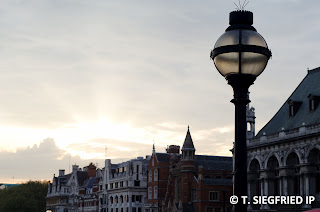

Daylight WB (5200 K)

Tungsent WB (3000 K)


The last image is taken on a subway. In this case, Auto WB is closest to Tungsten.
Auto WB (3550 K)

Flash WB (6600 K)

Fluorescent (6850K)

Daylight WB (5200 K)

Tungsten (3000K)

For the situation I have picked, Auto WB seems to be performing quite well. But then, I am not entire sure what is the difference visually when daily WB and shade WB are only 800K difference. For all three examples I have chosen, the difference is hardly noticable.
I took some street screens in London. I notice that I seems to like building lining up and form a diagonal line across the frame and tunnel with high degree of symmetry. I took couple more shots than just daylight, shade and auto just to see the effect. The temperature reading is taken in Lightroom.
The first image is taken on an overcast day with interval of sunlight. One can see the sun light shines on some of the building while the sky is covered with cloud. Auto WB reading is closest to the daylight. The difference between shade and daylight is very small, but if we alternating two images on light room, the daylight WB gives very slightly more blue tone on the cloud. I have to empathize that it is very slightly, hardly noticible.
Auto WB (5150 K)

Shade WB (6000K)


Fluorescent (6850K)

Daylight WB (5200 K)

The second image is taken at around sunset. It is also overcast with sun is near the horizon. Auto WB is still closet to daylight instead of shade.
Auto WB (5150K)

Shade WB (6000 K)

Daylight WB (5200 K)


Fluorescent WB (6850 K)

The last image is taken on a subway. In this case, Auto WB is closest to Tungsten.
Auto WB (3550 K)

Flash WB (6600 K)
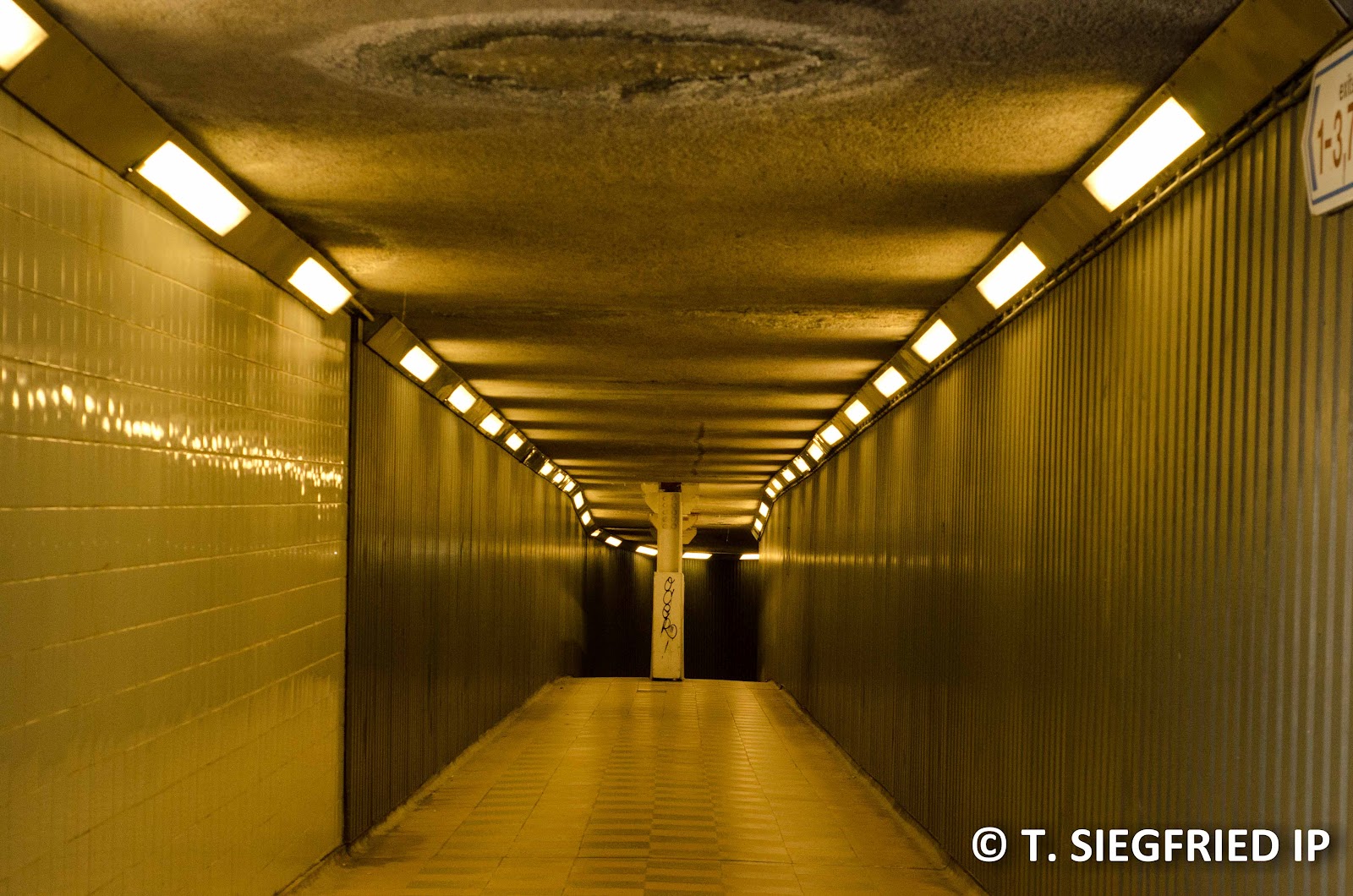
Fluorescent (6850K)

Daylight WB (5200 K)

Tungsten (3000K)

For the situation I have picked, Auto WB seems to be performing quite well. But then, I am not entire sure what is the difference visually when daily WB and shade WB are only 800K difference. For all three examples I have chosen, the difference is hardly noticable.
Subscribe to:
Posts (Atom)