Exercise 1 requires printing out image and checking distance, which is more troublesome, so I will start on Exercise 2 first.
In this exercise, I will take three photographs of the same screen with the largest aperture available. The depth of field decreases when relative aperture increases. Because I am using the largest aperture, the focus will only fall on a particular range of distance and left everything else slightly blurry. Ok, let’s try some shots. In Picasa, it has an image property called "subject distance" which track where the focus at. So let's check that out as well (not that I can see it when I am shooting).
In this exercise, I will take three photographs of the same screen with the largest aperture available. The depth of field decreases when relative aperture increases. Because I am using the largest aperture, the focus will only fall on a particular range of distance and left everything else slightly blurry. Ok, let’s try some shots. In Picasa, it has an image property called "subject distance" which track where the focus at. So let's check that out as well (not that I can see it when I am shooting).
50mm f/1.8 ISO 200 at 1/320s Picasa "subject distance" = 1.5m
50mm f/1.8 ISO 200 at 1/320s Picasa "subject distance" = 2m
50mm f/1.8 ISO 200 at 1/320s Picasa "subject distance" = 4.29e+009 m
I have a problem: I don’t really like these. I feel that the near focus image is too heavily weight on the lower right hand corner, and the middle image is not that much difference visually.
I checked Michael Freeman’s manual again on the set of shots he made, and wonder why all three shots he got look quite decent (ie not a single one that is totally superior to the other). I notice one thing: in the near focus image, the subject that comes into focus occupied more than half of the picture. If the front subject occupied too much down in the corner, the image will be sinking to one side. Which comes back to a question, what is the subject I try to emphasis? If I want to emphasise the front of the fence (as if something interesting there, but that begs the second question), then it should occupy more area of the image.
Of course, the second problem is, the fence alone is not really that interesting. Fair, the colour (blue and gold) is nice on the shots.
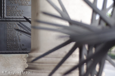
Ok, let’s try one more set. Think about this: The focus nob on my 50mm f/1.8 lens has scales on it. It goes from 0.45m to 3m then the next one is infinity. If I want to take advantage of the focus range, my closest subject should be about half a meter away, the far one is more than 3m away, then the middle one is somewhere like 1-2m. I need something big in the front so that the subject is not sinking to one side when I focus at the closest distance. Let's try this:
50mm f/1.8 ISO 400 at 1/250s Picasa "subject distance" = 0.71m
50mm f/1.8 ISO 400 at 1/250s Picasa "subject distance" = 1.19m
50mm f/1.8 ISO 400 at 1/250s Picasa "subject distance" = 2.51m
Better than before, but the colour is quite dull here.
Ok. My preference. For the first set with fence and lamp post, I prefer the one focus at the far end (3rd one). And for the second set with the spikes, the front and middle focus works better.
Why so?
For the first set of images, the further focus one occupied more area in the frame, it looks balance (and probably too typical). The front focused one is fine only if something special happening at the lower right hand corner, but there isn't any. I will wonder what is the point to focus at that spot.
In the second set, however, I am not too keen to read the words a the far end. The spike gives more interesting shape and direction. The middle one works better here than the front one.


No comments:
Post a Comment