Tuesday 28 August 2012

Exercise 28. Measuring Exposure, part I

As I mentioned earlier in another post, this is probably the most difficult exercise in this section. This exercise requires me to take 5 photographs that are deliberately lighter or darker than the average. The most difficult part is what is “average” mean in terms of exposure?

Say, what metering scheme are you using in your camera? If for the same screen, spot metering is telling me that the exposure is in the middle (I avoid the word “correct”), but matrix metering says that I am over-exposed, which one is right? Do you judge your exposure with light meter or with the histogram?

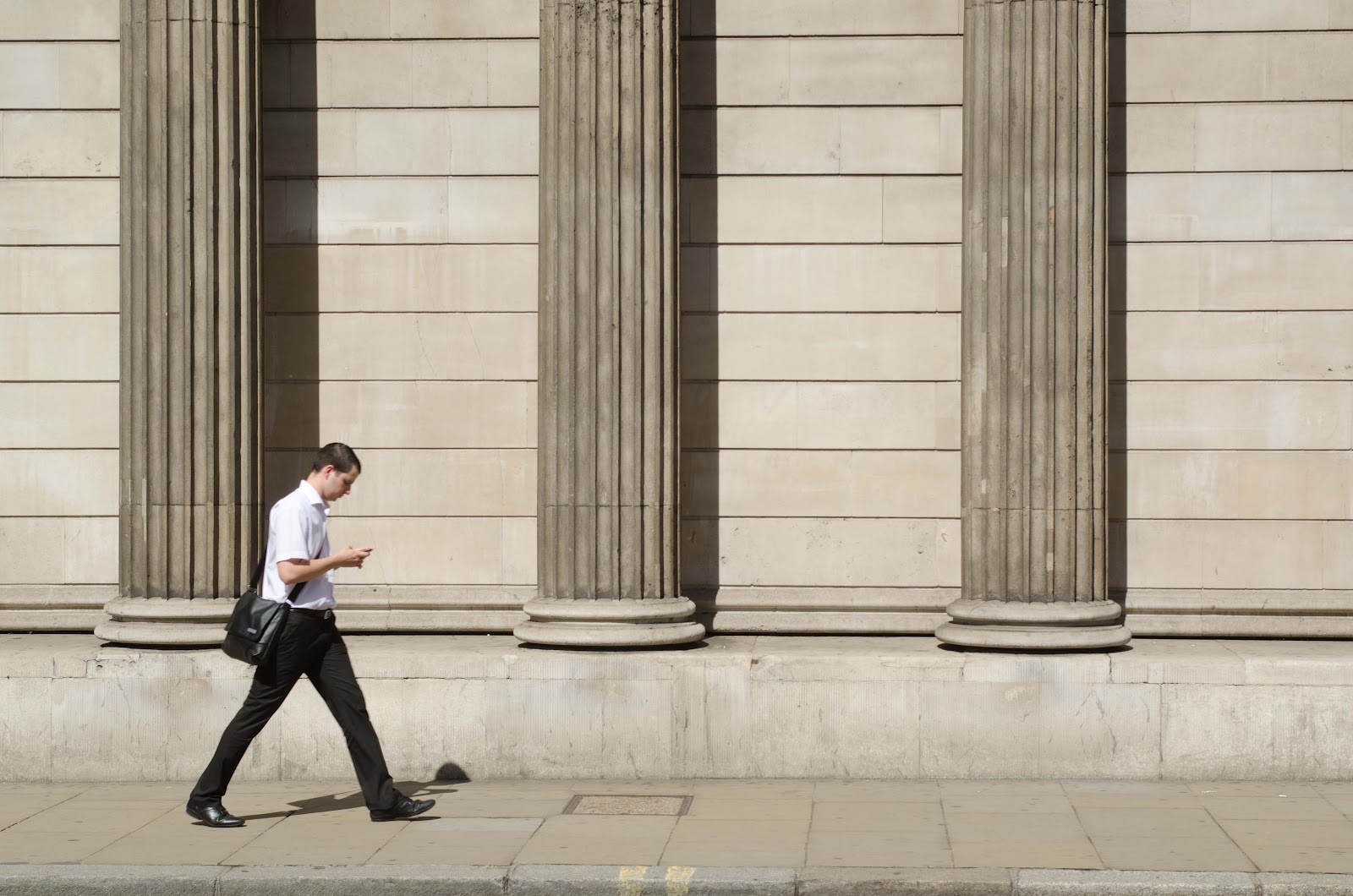
I think this is one of those ill-posed questions in photography. I use spot metering, so I only (at least try) getting the exposure right for my subject, while the rest of the screen can go to hell. If I change my metering to centre-weighted or matrix, I think most of my shot will be consider under/over-expose. Strictly speaking I rarely try to over or under expose my subject. Here are some examples on what I think the exercise is asking for:

1. In a screen with a lot of contrast, I can decide to expose for the shadow or expose for the highlight. There is limited dynamic range in the CCD sensor to keep both of them. 


I wanted to keep the detail of the shadow, so this image over-exposed in matrix metering. The highlight is blown on the sky, but I don't care about the sky as much here.  

There are situation in which the sky is more interesting, and I will under-expose the image in matrix metering sense to get more details there. 


There are situation in which either exposure will be correct, depending what do you want to expose for. In this image, I prefer the highlight than the detail of the shadow.


2. In a screen that is mainly white, the camera tends to have it look grey-er than it is. Therefore, I try to overexpose the screen to keep it white. I notice that it doesn't have to be purely white, but a uniform cream colour will cause the camera to underexpose. 


Alternatively, we will have the same problem with black background. It doesn't have to be pitch black. Even if I take this with mainly dark colour, the camera default matrix meter tends to over-expose. I need to stop down to get the exposure matches what I saw. 


Finally note on this subject: “Exposing to the right” is not totally a myth, but sort of a safe bet in a data collection stand point. Question: If you preview your image on the back of the CCD to judge its exposure, are you sure that your camera CCD is correctly calibrated? I can adjust the brightness setting and the image will give me a different look. So which one is right? If by the end of the day, we are fixing the photographs up at post processing; using the histogram gives a better indication than the light meter. 

Tuesday 21 August 2012

Exercise 34 Cloudy Weather and Rain

There are three section of this exercise.

1) Take 4-6 photographs of the same view in sunlight and under cloud

It is rare to have bright sunny day that is stable in England. So I will start with this one near Blackfaire station. F/4 at 1/1600s.


As soon as the cloud comes, the exposure time drops to 1/500s, also at f/4

The weather condition is not getting particularly better as the day progress. Now we are at 1/320s at f/4. 


Question: so does the cloudy shot looks more "blue" as the assignment suggested? Only slightly, and somehow it is hard to make a good judgement with naked eye. One can argue that the building in the photo in the middle does look slightly cooler than the first one, and the third one is cooler than the second one. But only slightly.

To make my point clearer. Here is St Paul shot across the river. The first one was shot in the morning, and the second one is shot at the evening. If I only use naked eye to judge, somehow the second one looks warmer. Why? The angle of the sun shinning through the building lights up both the Millennium bridge and five a less dark grey colour. I think this exercise doesn't work as well, unless all other external condition is fixed.  


Anyway, move on. The exercise suggests that we find two images in our library that is taken in cloudy day and it won't be better if it is taken on a sunny day. 

Well, this is difficult, given that I am a manic who like to shoot in the bright sunny day. To make it worse, I shoot into the sun. There are exception. I think no one will recommend doing a portraiture under harsh sunlight (well, well, we saw it in Saatchi gallery in the last study day). For example this:


I have never done food photography properly. This is not cloudy day, but indoor shot. I think sometime people use sun to create some atmosphere. But for this shot, I prefer not to have some sort of bright sunlight because my main subject is food, not atmosphere. 


I need to cook more often. Eating out too often just make me fat.

Now to the second part of the exercise.


2) Take three photographs outdoor on an overcast day. Look for the type of subject with strong colour and another one with strong detail.

How about that "every little helps" store? Very strong colour that you can see a mile off.


Actually, I prefer colour under bright day light, but with this type of orange, it doesn't look as dull in an overcast day.

Here is some structure with more details.


And do we count rain drop as part of the details?


3) Take two photographs in the rain

I don't think this is exactly an inspiration. When I miss my train, I usually wonder around the station and take photographs. Guess what, I shoot in the rain often due to total boredom. 


Yeah. I am almost done with the exercise in part 4. Maybe I should start worrying about the assignment now. 

Exercise 28: Measuring Exposure. Part II

There are two parts to this exercise. The first part requires me to take 4-6 photographs which are deliberately under or over-exposed, and analyze why it is a good choice. The second part requires me to select 5-6 subjects, and mark 5 exposures (light and darker) at each one, and select one that I prefer.

Believe it or not, the first part is actually more difficult than any other exercise in this section. I am not too sure about what is "underexposed" or "overexposed" means technically. If the question is whether or not I use the built-in light meter inside my camera, and anything that light meter indicates as "underexposed" means underexposed, then I will get different answer on the same setting with different metering type. Personally I use spot metering most of the time, and most of the images I took is not "correctly" exposed based on the light meter, given that the mid point is usually not at the centre.

Anyway, I did the second part first.

First screen, the subway. If I care about the detail on the stairs, I prefer the fourth one. Otherwise, the second one has better atmosphere(ie no one pays to keep the subway so well-lit).


Second screen, the river bank. I prefer the second one.


The third screen, sunset. I prefer the last one. However, one can argue that the third one gives a better balance on sun and the cloud.


Fourth screen, still sunset, but I changed location. The first one and the second one works for me. Somehow the sun is the main subject here. In the later shot when the exposure is higher, it lost the details of the sun, but not providing enough details on the pier.


Fifth screen, the street lamp. I prefer the third one. However, I have to admit that the difference between all of them are not that big (ie there is no lost of details on the subject). It is really depends on the atmosphere you want to get.


So after 25 boring images, what is the conclusion? I have to admit that I like slightly underexposed images. However, I don't think by differing by 2/3 of stop will be the end of the world. The resulting image will be different, but not horrible. I have to say that this is at odd with the concept of "exposing to the right" in digitals, and "exposure the shadow and the highlight will take care of itself" in film. Sometime I feel totally technical advise ignores the effect one might want to create. Of course, that goes the same with the whitebalance. Has anybody thought of setting an "incorrect" whitebalace just to make the screen look more yellow (tungsten)? Would that give sort of an old age atmosphere? If we are manage to pre-visualize what will come out at the end, does it matter if we have the "correct" exposure and whitebalance. 

Just a thought, I am sure someone will beat me up for that one day.

Thursday 16 August 2012

Exercise 35 Tungsten and Fluorescent Lighting

There are two parts in this exercise. First of all, I need to find a place indoor that is lit by tungsten lamp with window, so that the exterior at dust is visible. I have to wait until the light level inside and outside are approximately equal, then I will take three photographs with white balance setting  of: auto, daylight, and tungsten.

I have to admit that this is such a weird exercise. I guess the final point is to say if you mix light source, you will never get the white balance right. Composition wise this is a weird one. I can't find anywhere near my windows that looks interesting, so I decide to just go for anything. The main difficulty is, actually the light level at my place is very dim. I have to wait forever to get the light level about right. To be honest, I still think it is slightly dimmer indoor.

This is from auto whitebalance. Notice that the vase is supposed to be white but it is not. The fence colour looks fine.


How about Tungsten whitebalance? Well, the vase looks white, but the fence is slightly on the blue side. 

Using daylight whitebalance, the fence will get closer to its original colour, but not the vase. Notice that this is very similar to the result we got using auto whitebalance.


The second part of the exercise, I have to find two different indoor places that is lit by fluorescent lamps and by CFL lamps, and take 2-3 exposures at each location with white balance set to auto, and fluorescent. 

The easiest way to find fluorescent lighting is in the office. This is my messy desk with stuff flying all over the place. In order not the add more lighting sources, I turned off the LCD monitor. Here is the one with fluorescent whitebalance.


This is with auto whitebalance.


If the desk is not a good reference, the paper on the left hand side is supposed to be white. Auto whitebalance gives very slightly yellow, but only very slightly. However, somehow I feel the auto whitebalance is more realistic to me. 

Now for the CFT. I have those light blub (or light tube) in my home. Again for easy reference, I am photographing something white.

This is the one with auto whitebalance.


This is with fluorescent whitebalance. So weird...

 I have to admit that it is much easier in the film world that there is indoor and outdoor film, but not seven different settings for all sort of whitebalances. Did we gain from the technology? Yes. Because now we have more tools in the toolbox to attack a problem. However, what we seem to have lost the tolerance for anything less than "perfect". Was the vase so white when I look at it? Sometime I feel that the "correct" whitebalance gives me a slightly surreal screen.