This is a little bit of a random post, but it is not as random as you may think.
In the feedback from my tutor Matthew Winterlich in assignment 1, he noticed that I have mentioned that I have no interest in being a photographer, and in fact "You can have no education, no job, but you can still call yourself a photographer." The original post I believe is here:
http://art-of-photography-sip.blogspot.com/2011/11/three-months-after-enrolled-in-oca.html
He gave me links on the skill requirement of photographer as an career and suggested that I should start a discussion on the OCA forum. I yet have a chance to see how that post goes (or if anyone bother to comment). To be honest, I was not too into discussing why others want to become a photographer while I don't. It is a matter of personal choice that one has to learn to respect (in my opinion).
I have been reading some articles lately and this topic springs back to my mind. I can't quite elaborate how I feel at the moment, so I will post the link and quote directly. The person in the "interview" is Stephen Eastwood, a famous fashion photographer in United States.
Here is the part of the interview that I find interesting.
"As a career, never make it about you or your views of beauty. If you want to succeed, understand that the client and the market the client is aiming for decide what is beautiful. You simple have to be able to accept that and make it come to life in your image despite many things that will work against you, from the wrong model, to the wrong concept, to the wrong art director and set designers. At the end of the day it is all your responsibility to supply a great product, which in this case is an image that sells what the client wants to sell. Next never be afraid to use retouching to complete the job. It is what is expected in todays world, people are not use to seeing real, they see perfect people and perfect skin, that is not possible in a day to day job, so being able to create it is what it is, and it is what will make you successful. Clients do not want to hear excuses, no matter how true, or whose fault it is, they don't care, realize that going in and make sure you can respond to everything and supply what they need and or want. "
Here is the rest of the interview.
http://www.stepheneastwood.com/bio/
Friday, 30 December 2011
Tuesday, 6 December 2011
Review: Bearing Witnesses: Five Years of the Iraq War -- Image from Reuters
One of the comment I have received from Assignment is that the tutor would like to see some reference to the work of other practitioners and any influence that might have upon my work.
And I am supposed to blog it on the learning log.
Oh well.
So let's start with my favourite photograph of all time. I do not know the name of the photographer who took this, but he belongs to Reuters News Agency. This photograph first showed up in an exhibition in Shoreditch, London, under the title "Bearing Witnesses: Five Years of the Iraq War" back in 2008. Due to copyright, I am not supposed to just post the image here, but you can see it in the flash video in this link.
http://iraq.reuters.com/
If you hit "click to start", the photograph I am looking at is the very last one in the flash video before the credit roll. It is roughly at around 4 minites 11 sec. The shot features a man who is blind-folded walking out a vehicle, while the reflection on the back windows show the reflection of a soldier look at the blue sky. The facial expressions of the two men are complete contrary: the soldier looks happy, while the blind-fold man looks uncertain.
Technically there is a lot to say about the photograph. For example the balance of the image between two men almost equally devide the frame, the eye-catching red (car frame) vs blue (sky) combination that meet at a third of the colour wheel, or the detail of the soldier eventhough he is just a reflection of the window.
However, sometime photography technique doesn't mean much. Personally I have seen shots are are technically perfect but they are just boring. The image carries a message, story. Usually it is very difficult to construct or encounter such screen. I think it is the shape contrast between the two men's facial expressions that lead me to the question "so, what happpened?". Of course, exhibited under the title "Five Years of the Iraq War" gives some direction for imagination. So I guess this makes sense to put title on you images, because it gives view additional information to guide their minds. It should not be surprised that the US soldier comes out victorious. In fact, shortly one month after the war was started, US had declared the "war effectively over". The irony is, as of 2011, with the amount of civil unrest, it is not clear if anybody has won at all. For the local Iraqis, regardless which sides they take, their future is totally uncertain.
We don't know what the actual event between two men, but the image is so iconic of the Iraq war. Basically one image highlighted the irony of this war.
It worth noting the the colour of reflection is very clear. I wonder if it is possible to get such strong colour naturally (ie without editing it in post process).
Monday, 5 December 2011
Assignment 1: Feedback and re-shoot, Part 2
So back to the re-shoot #2 for assignment 1. This is for the image transparent. The tutor mentioned that the original shot has too many distracting shadows and reflections. It was my least favourite shot anyway, so let's redo it.
The only flash I have is a Nikon flashgun. Here is the rest of the poor man set up: There are two backdrops. One is the lining paper for wallpaper, which cost only a pound at the pound stop. The other one is the mail wrapping paper, which cost only a pound fifty at Reyman. There are clamps to hold the reflector and backdrop which cost 2.50 and the softbox is just a piece of A4 paper stick to the flashgun. LOL.
First of all, let's try this set up, which is typical for portrait.


I am not sure if this is better or not. The light spot on the left is gone, but the dot on the lower right hand corner is still around. There are varies reflection on the glass, if you zoom in close, it is reflecting the surrounding (ie my camera, curtains, etc).
It doesn't seem to work, so let's try another set up. The first issue is my A4 softbox is not big enough, so let's get a bigger one, say the wall. There is no flat wall at my place so I want to try bouncing the flash off one backdrop, while the other backdrop sitting over the OCA course material box.


I think they look ok, but here is a catch. If I want to be a pixel-peeper and zoom in at 100% crop, the reflection at the lower right hand side of the glass is not that clean. I can actually see the end of the backdrop there. I really can't tell at the stage, what constitute a good catalogue type product photography?
The only flash I have is a Nikon flashgun. Here is the rest of the poor man set up: There are two backdrops. One is the lining paper for wallpaper, which cost only a pound at the pound stop. The other one is the mail wrapping paper, which cost only a pound fifty at Reyman. There are clamps to hold the reflector and backdrop which cost 2.50 and the softbox is just a piece of A4 paper stick to the flashgun. LOL.
First of all, let's try this set up, which is typical for portrait.

Ok, I get something.

I think the softbox is not big enough, so the big-ish spot on the left is the softbox. The spot on the lower right is not clear to me what it is. Fine, let's bounce the flash off from the ceiling instead of blasting it straight at the glass.

I am not sure if this is better or not. The light spot on the left is gone, but the dot on the lower right hand corner is still around. There are varies reflection on the glass, if you zoom in close, it is reflecting the surrounding (ie my camera, curtains, etc).
It doesn't seem to work, so let's try another set up. The first issue is my A4 softbox is not big enough, so let's get a bigger one, say the wall. There is no flat wall at my place so I want to try bouncing the flash off one backdrop, while the other backdrop sitting over the OCA course material box.

Ok, I get something.

The background colour looks weird, but it is not the end of the world. The light spot on the left look smaller than the right, so maybe I should push the reflector in a little bit. At the round part of the glass, the left side is brighter than the right, so maybe I should have the glass closer to the wall? Something like this:

I think they look ok, but here is a catch. If I want to be a pixel-peeper and zoom in at 100% crop, the reflection at the lower right hand side of the glass is not that clean. I can actually see the end of the backdrop there. I really can't tell at the stage, what constitute a good catalogue type product photography?
Sunday, 4 December 2011
Assignment 1: Feedback and re-shoot, Part 1
I got the feedback from my tutor a week ago. There are several recommendation he pointed and I am (slowly) digesting through and re-shooting the images. So the feedback section will be in several post.
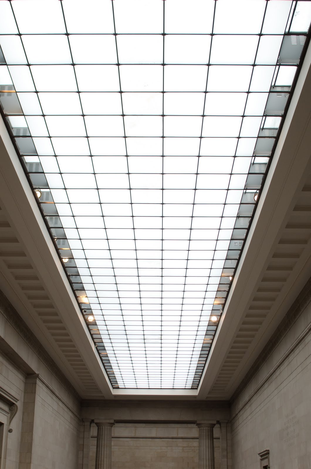
The first image I am looking at is the "board" image, taken in the ground floor of British museum. Here is the shoot that I submitted.

This is something that I never noticed. The tutor told me that there are deep shadow in the foreground and the background is well-lighted by windows on both side. Therefore there is a problem with colour inconsistency. I asked about how to do this shot properly. He mentioned about using flash lighting the foreground, or move the tonal curve in post production. Latter should be quite easy to do, so I open the image and change the tonal curve.
As it happens, if you make the shadow area brighter, it is not so easy to totally isolate the brighter area. So I ended up in putting a mask on the background to dim it down. Also, colour wise the background look white while the ceiling at the foreground look yellow-ish. I find out the best way to fix it is to change to colour temperature. It is not perfect, but it ends up to be something like this.

What an irony. Without knowing it, I am heading the path of a photoshopper.
Saturday, 3 December 2011
Exercise 20: Curves
This exercise asks for 4 image that contains elements of curves.
Road is the natural indication of a curve.


Road is the natural indication of a curve.
Image 1: 50mm f/8 ISO 640 at 1/200s

Or from architectural element. Although there is horizontal line in image 2, but the central focus is around the brightest element, which is a semi-circle.
Image 2: 50mm f/4 ISO 1600 at 1/50s

Spiral staircase is a typical example.
Image 3: 28mm f/4 ISO 400 at 1/160s

Repeated pattern to reinforce the curves.
Image 4: 50mm f/5 ISO 1600 at 1/125s

Exercise 18: Horizontal and Vertical Lines
This exercise requires me to take four images showing horizontal lines and four images showing vertical lines, with no overlapping subject within each group.
This is probably one of the most difficult exercise. It is not difficult to find lines, but usually there are too many things on the background so that it doesn't stand out. It applies especially to horizontal lines.
Image 1-4 have some repeatable pattern to emphasize the vertical-ness.


This is probably one of the most difficult exercise. It is not difficult to find lines, but usually there are too many things on the background so that it doesn't stand out. It applies especially to horizontal lines.
Image 1-4 have some repeatable pattern to emphasize the vertical-ness.
Image 1: 50mm f/6.3 ISO 1600 at 1/25s

Image 2: 52mm f/5 ISO 400 at 1/40s

Image 3: 50mm f/4.5 ISO 800 at 1/50s

Image 4: 70mm f/5 ISO 1600 at 1/160s

Horizontal lines are so much harder. Sometime the image is really not as clean and it mixed with some elements of verticals and diagonals. For example, the emphasis in image 5 is the contrast of the light against the dark building, but there are also some vertical element going on. The tree lines are very noisy in image 6, so the wall and the sun does not stand out as strong as it should be ideally. Image 7 has multiple horizontal line in the front and in the background. However, the line implied by the stair case is stronger so that I would think the image is more "up" then horizontal. At this point I really can't see a single situation where the horizontal element is dominating the image. I would like to see one if there is an example.
Image 5: 50mm f/3.5 ISO 1600 at 1/60s

Image 6: 50mm f/8 ISO 640 at 1/160s

Image 7: 50mm f/9 ISO 640 at 1/125s
Image 8: 50mm f/7.1 ISO 100 at 1/160s

Monday, 28 November 2011
Exercise 19: Diagonals
I can't explain why, but I find it is much easier to recognize diagonals then horizontal lines. It might be the later is too boring. However, when I walk on the street, many things look diagonals to me anyway.
Say how one end of the street lead to the other end, or how the stair going from low to high.


Sometime even the plant line up in a diagonal manner.


Say how one end of the street lead to the other end, or how the stair going from low to high.
Image 1: 50mm ISO 1600 f/4 at 1/20s

Image 2: 50mm f/4 ISO 1600 at 1/40s

Image 3: 70mm f/5 ISO 400 at 1/200s

Sometime the pattern on the street.
Image 4: 50mm f/1.8 ISO 100 at 1/320s

Exercise 17: Multiple Points
In this exercise, I am supposed to construct a screen starting with one point and gradually add more object in. I set up the remote flash on the side and fired at about 45 degrees angle to the subject. I try to put a piece of white cloth in front of the flash to soften the light, but it just doesn't seem to be any softer. Maybe next time I should try bounce it off from opposite direction.
So we start with one big bowl of tomato. I want this to be my central subject, so I want it to be bigger to begin with.


The screen is quite empty, so let's put some small ones in the empty space. I put them in lower left corner to be some balance on the image.

Keep putting more on the empty space on the screen. Now I got something like a triangle dynamic. The big bowl still dominate the screen.

Instead of triangle, I want to move it a little bit to form a square. As it turns out, perfect square is not too interesting visually.

So maybe a tighter circle around the bowl looks better?

With this construction, I move thing around just to see if other configuration looks any better. So let's say I want a diagonal line.

So wired with round tomato. The un-natural line extension is taking the focus away from the bowl.
Let's try the triangle again with different amount of tomato.

It still looks fine as long as the sides are not too heavy to take away the weight on the bowl.
I just have a feeling that even though I use remote flash instead of on-camera flash. The light source is just too small and it is why I see a white spot on the tomatos. A single piece of clothes is not enough to diffuse the light, so I think bounce flash might work better. I should also plan for a reflector next time so that the tomato is not so dark on one side.
Maybe I should get a book on still life photography...
Wednesday, 16 November 2011
Exercise 16 The Relationship Between Points
In this exercise, I need to photograph two separate points. Then look at the relationship between the two. In theory there should be one that dominate the image.
Image 1: 50mm ISO 800 f/4 at 1/250

First of all, the two points stand out against a rather noisy background because they have distinct colour. The shape on the right hand side is dominating the image because it is larger.
What if I photograph something with equally dull colour or about the same size and same shape? Back to my home made studio with harsh lighting.
Image 2: 50mm ISO 400 f/11 at 1/100

Now it is less obvious on which one is dominating. I would say the Very Lazy Garlic on the upper left slightly dominates with longer shadow and clearer word. But if it is the case, this image looks rather floaty because the Garlic is too far up. I guess it is a bad idea to put the dominate subject too far up, and probably a bad idea since it is small and behind.
If I want to play it safe, the standard two points image will involve a much bigger subject compare to a smaller one on the other side of the frame to balance the image out. I think it should be a good consideration if I want to arrange vegetables for still life next time.
Image 3: 200mm ISO 100 f/11 at 1/640

Exercise 15 Positioning a Single Point
This is the first exercise in the second section of the course. Elements of design contains the study of point, lines, curves, pattern and shapes. In this exercise, I need to first jot down as many types of situation that would make a clear photograph of a point.
So this is what I think:
First of all the background has to be plain, or blur (such as boken using large aperture) to avoid distraction. Then my subject has to be a singular (since we are talking about ONE point). In order to achieve that, I want either only one item on the frame, or one item with very bright colour, the rest with dull colour or simply blurry. It is also possible to use spot light to isolate the one subject out of many similar item in the background, but I am no good with lighting so it won't be easy for me to create that.
The second part of the exercise involves positioning a point on the image. The first shot involve setting some sort of studio at home. The background is some postal wrapping paper on sale in Reyman at GBP 1.69 a roll. The main light is a remote control SB-600. It is kind of harsh lighting that I should use some sort of reflector to bounce it next time. It looks okay here because there is a lot of space and hard shadow fills some of those emptiness.
It should be no brainer that this is indeed a point (only one small jam in front of plain background).
Image 1: 50mm f/11 ISO 400 at 1/100s

The next image I want to get some brighter colour object that stands out in front of some boring background. I see this post at Charing Cross. Bright yellow stands out of dark green. I use large aperture to make the background more blurry.
Image 2: 50mm f/1.8 ISO 400 at 1/500s

Image 3: 50mm f/5.6 ISO 400 at 1/500s

It is not hard to picture a point, but I find it hard to balance to image if there is only one thing in the picture. Some of the shots look somewhat artificial to me. Oh well.
Thursday, 10 November 2011
Three months after enrolled in OCA programe, have I improved at all?
Who knows???

I really like this cartooner named Aaron Johnson. More of his work can be found here. http://www.whattheduck.net/
I happened to be in the KIKK vs Tottenham match two weeks ago, and ran into Elise, the football player in training from KIKK. I passed her my card. She noted that my title is "A Camera User", but not a "Photographer". I laughed.
In these day, anyone can call themselves a photographer. You can have no education, no job, but you can still call yourself a photographer. There is not even an exam to pass, a license to get. I simply don't see the worth behind this little title.
By the way, I am a camera user. As it implies, I use camera.
Saturday, 5 November 2011
Assignment 1: Contrast
The first assignment requires me to produce 8 pairs of shots that show contrast in separate images.
1. Big/Small


2. Diagonal/Round


9. Thin/Thick


10. Opaque/Transparent


Two concepts in one picture: still/moving

1. Big/Small


2. Diagonal/Round


3. Dark/Light

4. Many/Few


5. High/Low


6. Black/White


7. Board/ Narrow


8. Still/Moving


10. Opaque/Transparent

Two concepts in one picture: still/moving

Subscribe to:
Posts (Atom)