Monday, 14 May 2012

Exercise 33 Variety with a Low Sun


It is hard to find opportunity to photograph lighting using the sun when we have three weeks of rainy days. Personally I feel very tired as well. I have at least 500 images that I have not yet reviewed. On top of it I am still reading the material suggested by my tutor on assignment 3. Re-doing the whole assignment in that direction is actually very difficult.  I have some ideas, but I am not getting the type of shots I have in mind yet. 


Three weeks before the deadline. Oh well...


Anyway, in this exercise, I will take four photographs with the sun at different angles.


1) The Sun is behind the camera, striking the subject fully.
2) Side lighting
3) Back lighting
4) Edge lighting


The first image is taken about an hour before the sunset. The bridge and the cloud are actually the main subject. The colour is so vivid. It seems that to have a colour appear to be more saturated, first of all the colourant has to be saturated, but then strong and direct lighting helps bring out the effect. I wonder if it is because a shade will appear and show the colour in different scale if one light the subject from the side. As a result, the area of which the subject's colour appear to be most saturated is less.


This is the image with the tree illuminated by side lighting. The shadow is long and visible.


The very characteristic picture of back light consists of a silhouette.


This is the edge lighting I have in mind. I think it is possible to pick a smaller subject so that the whole subject will have a glow on the edge.


Tuesday, 1 May 2012

Exercise 31 Judging Colour Temperature 2

In this exercise I will select three subjects and photograph the same screen with different setting of whitebalance: daylight, shade, and Auto.


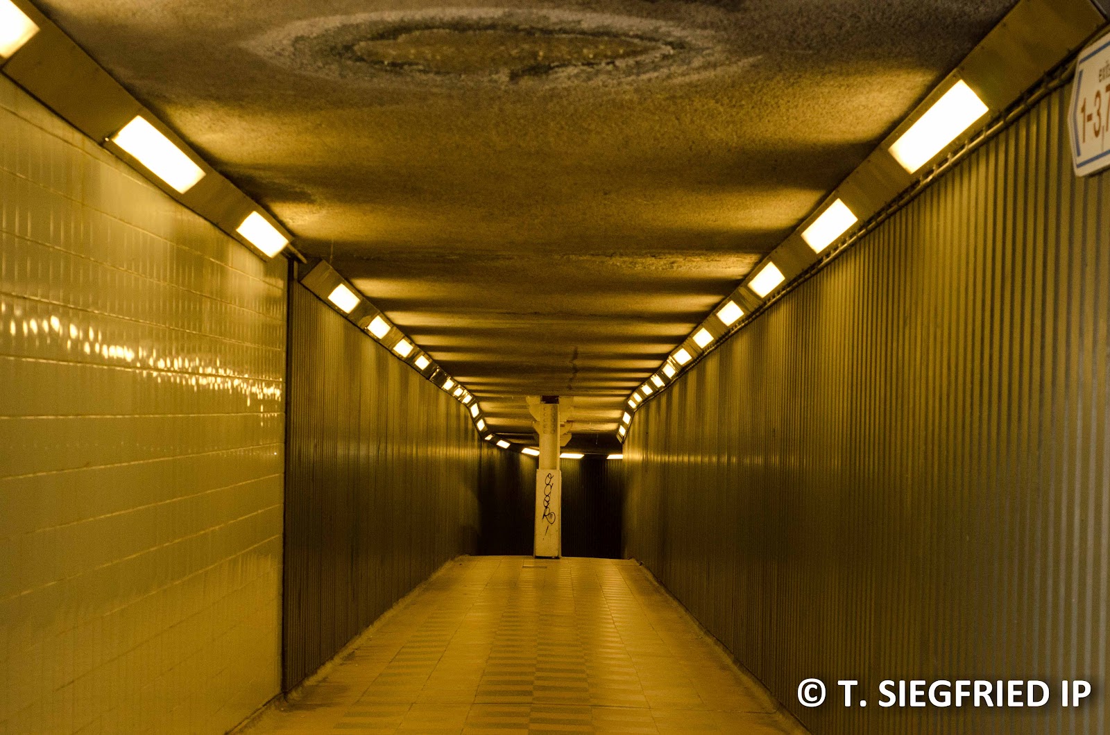
I took some street screens in London. I notice that I seems to like building lining up and form a diagonal line across the frame and tunnel with high degree of symmetry. I took couple more shots than just daylight, shade and auto just to see the effect. The temperature reading is taken in Lightroom. 


The first image is taken on an overcast day with interval of sunlight. One can see the sun light shines on some of the building while the sky is covered with cloud. Auto WB reading is closest to the daylight. The difference between shade and daylight is very small, but if we alternating two images on light room, the daylight WB gives very slightly more blue tone on the cloud. I have to empathize that it is very slightly, hardly noticible.


Auto WB (5150 K)

Shade WB (6000K)

 Tungsten (3000K)

Fluorescent (6850K)

Daylight WB (5200 K)


The second image is taken at around sunset. It is also overcast with sun is near the horizon. Auto WB is still closet to daylight instead of shade.


Auto WB (5150K)

Shade WB (6000 K)

Daylight WB (5200 K)


 Tungsent WB (3000 K)


Fluorescent WB (6850 K)


The last image is taken on a subway. In this case, Auto WB is closest to Tungsten.


Auto WB (3550 K)


Flash WB (6600 K)

Fluorescent (6850K)

Daylight WB (5200 K)

Tungsten (3000K)


For the situation I have picked, Auto WB seems to be performing quite well. But then, I am not entire sure what is the difference visually when daily WB and shade WB are only 800K difference. For all three examples I have chosen, the difference is hardly noticable.

Monday, 30 April 2012

Assignment 3: Colour? Architecture? Culture?


This is the other part of the continuation of assignment 3. Given that the assignment I submitted back in March was about urban landscape (more or less building was all I did), we are down to looking at what type of building I see around London. When I did the assignment, I didn’t visit anywhere particularly scenic. Given that there is strict requirement on colour, I gave up on finding the best looking, or most representative buildings and opts for the one with the colour combination required by this assignment.


About the Colour of Bricks

The colour in an architecture design usually associated with the building material used. For most English residential house built before 1970, the colour of the exterior is determined by the colour of bricks and roofing tiles. Even today, some of the modern housing designs still put a skin layer of brick on the exterior to preserve that aesthetic appeal.

Bricks are used in English housing frequently because of the speed and cost associated with creating a brick. There was a large demand of housing since industry revolution and bricks are often the material of choice. They are everywhere in the city and suburb area, although they are not particular glamorous or iconic.

Although one can put in dye during the brick making process, most of the brick used in the London and south east area are mainly yellow or red. Some bricks may appear to be black/grey. Some of them originally are yellow, but lost they appeal because of air pollution. The yellow brick is known as London stock. It is made soft yellow clay fitted into an iron faced block mould. It was once as seen as fashionable for working class housing.

In Victorian London, the bright red brick was chosen to make the building more visible under heavy fog. The goal was to reduce number of traffic accident in foggy weather.

Most of the roofing tiles I see around London are red. However, I cannot find any note on why they have to be red. I believe the material that made tiles are mainly clay, but what is not obvious is why no one dye it, or use difficult colour of clay. There are houses that recently re-tiled that have black tile.


Culture Aspect (again?) of Colour

While my tutor suggested me to look into culture aspect of colour, my assignment was about urban landscape. For everything to tire together, we are trying to link several elements together: 1) Colour 2) English culture 3) English architecture (at least on residential housing level)

As I note earlier that a major deciding factor of choosing building material is cost and speed (I wonder, if the right word is really availability instead of speed). There is nothing particularly English about the decision. Historically issue that favour yellow (availability) or red (particularity for reducing accident) has nothing to do with the culture here really.


Assignment 3: Cultural Aspect of Colour


This is sort of the continuation of assignment 3. On the last post, I mentioned that my tutor suggested me to research on the cultural aspect of colour. It takes a while because there is no authoritative reference text out there on this subject. There are a lot of loose articles from what-so-called “research”, but they are more of commentaries. Here is bit and piece of the summary on what I have read and some of my reflections.


Culture Aspect of Colour

Some articles talks about what a particular colour is used as a “symbol” in particular country. I put quote around the word “symbol” because the relationship between colour and the subject is more of an association, rather than symbolization. I prefer to use the word "symbol" as a representation. You see a symbol and this will come to mind even if there is no word or other message. For me, to say colour is a symbol of XXXX means that you will be thinking of XXXX if you see this colour.


An article I came across says that green is “symbol” of money in US. It is true that US dollar usually refers to as “greenback”. It is also true that the one side of the US dollar (it is the back side, if you like) is printed in green ink. However, what is not true is the Americans invoke the thought of money when they see green. For example, it is unheard of that somebody walks into a park on a summer day, seeing the beautiful green leaves on trees, and the screen triggers the image of cash.

Some of the old tradition on the use of colour exists because of the taste of rich and powerful in the past, or because of availability of the material. For example, certain colours are difficult to product in the last so it becomes “symbol” of kings. Some of the tradition, such as wearing black clothing to a funeral, is observed because the lack of interest for general public to do something special. However, these linking changes in many areas, because of technological advance make many colours become available to normal people and transformations in social structure that we feel we no longer need to observe some tradition appeal in a strict sense. As a result, if we need to discuss about the culture aspect of colour, we should also ask ourselves what we mean by the word “culture”. And, if we accept that “culture” is a constantly evolving breast composed on many individuals’ tastes and preferences, we should an also accept that the link between culture and colour is evolving.


Association with Colour

The links between colours and everyday subject is not entire zero. There are some permanent subjects out there that are immune to change. Here are some objects that we see every day and they are almost in the same colours.

        Sun – Red/ orange
     Fire – Red/ orange
       Grass/ Tree – Green
    Clear sky – Blue

Therefore, one should not be surprised that red/ orange side of the colour wheel is called “warm colour” given that we can directly experience the warmth of the sun, while the sun is unlikely to change colour (with its current mass, it will never make it to a blue giant even before it blows up).

One should note that this association has to do with what we usually see. For example, fire does not have to have red/orange colour. If you use natural gas a fuel, the colour of the flame would be blue. While the flame is still hot, the association between “hot” and blue is rarely seen. I believe it is because we see colour as a visual observation. Most people use natural gas to set up a flame is in the kitchen. As soon as the fire is up, they put the pots and pans over it. As a result, they never really set up a blue flame, observe and appreciate the warmth of a blue flame. Therefore, it doesn’t matter what colour the subject can appear in, but what we usually see them.

Apart from the permanent fixtures, there are the “semi-permanent” ones. There are situation when a subject does not have to appear as one colour, but there is a social pressure to maintain such an association. An example of this is the application of the colour red in stop signs, traffic light. When we see a red sign, we are most likely to stop or slow down to see what the information is. This type of association works with the backing of the law to reinforce such belief. For example, one will get punish if he/she disrespects the red traffic light. Without such backing, the association have little strength. For example, while green traffic light is walk, one is not under obligation to cross the road. Green road sign is use for information, but people don’t usually hit the accelerator when they see a green road sign. There is no punishment, so the association of green and walk/run is not quite there.   


Gender and Colour

I happen to come across this topic as I was curious on why parents decorate the baby room in blue if they are expecting a boy, and decorate it is pink if they are expecting a girl. I came across online article saying that the tradition was reversed. Before the First World War, pink is the colour of boy because it has stronger colour, while blue is more delicate and more suitable for girls. Here is a magazine cover of in that age, notice that the girl is illustrated in blue dress.


At some point the specification with gender changed in 20th century. Some said that because of the blue uniform soldier wore (which country though?), while other said blue dye is cheaper for school uniform. Someone suggested that NAZI used pink as the colour code for homosexuals, so men tries to distance themselves with this colour. I doubt this is the reason, because it implies that women are happy to associate themselves with homosexuals.


Uses of Colour

There are two areas that discuss about putting colour together to form some impression, and they are flouriest and interior designer. The general working process seems to be 1) pick if you want to have contrast or similar colour 2) put something together from that side of the colour wheel and see if they look good. The working process to match colour is about how you feel than putting in straight rule. Florists go about the “flower language” of different flowers mean. Honestly I struggle to see why red rose means “I love you” but orange rose means something else. I also wonder why there exists flower that means "I love you" but there is no flower means "I hate you". Given that both love and hate are constantly re-occurring human emotions.


Summary (?)

I am not sure that I should summarize given that nothing makes sense to me. I struggle to see a consistent link between culture and colour other than old wives tale or wishful thinking. Not to mention, in order to really analyze this topic, one has to be particular about which culture, what culture and what influence this culture. It is more interesting as a sociological or anthropological discussion than a photography discussion. However, I don’t think there is no link between colour and culture.

     1) There are object that we experience constantly that have consistent colour. An example of this is we experience warmth from the sun and the sun is red/orange
2   2) There are social agenda to associate certain colour with messages, with strong backing by law to reinforce this association. An example of this is red sign, traffic light means stop.
        3) There are other intentional or unintentional agenda to associate certain colour with messages, such pink for girls and blue for boys. Such association is usually back by media (advertising). It can change with time and the association may not apply to everybody in the society.


******************************************************************* 


To be honest, it is difficult to get back to assignment 3 at first because it really has been a while since it was submitted. I need to check my note and see what I have in mind when I was working on the assignment. To try to learn something around the topics around colour is one thing, but trying to tire this back to what I was working on (urban landscape) is another. With architecture, the exterior colour strongly associates with the cost and availability on building material, instead of social likings. I am reading a little bit more and write something about it. Hopefully it will tire back to my assignment somehow.

Thursday, 26 April 2012

Exercise 39 Contrast and Shadow Fill. Part II

This is the second part of the exercise -- replace the white card with aluminium card. I separate this from the first part because the conclusion here is different and these set of images should be viewed without those in the first part.


The light is positioned on the right side of the screen, with a softbox. I try to do a better job in fixing the tiger toy this time and shoot slightly tighter (still some empty space at the top, but the eyes is at 1/3 level). There is also catch light on the left.


Same as last time, I will start with my observation first:


1) I cannot see the difference between produced by the dull and shiny surface of Aluminium foil. The brightness is almost the same on the left side at both 10 and 20 cm. However, the catch light on the left eye is more concentrate with the shiny Aluminium. The dull side is more diverse (larger area, but seem weaker)


It is either there is little difference, or the co-corp Aluminium foil is not shiny enough to differentiate itself from the dull side.


2) The brightness on the left side of order of strength will be: Dull/Shiny > Crumbled side > white card. It tells me that an Aluminium foil is a more powerful reflector than the white card.


Here is the set of images:


1) No reflector


2) White card at about 10cm away on the left


3) Dull side of the Aluminium foil at 10 cm away on the left


4) Shiny side of the Aluminium foil at 10 cm away on the left


5) Crumbled Aluminium foil at 10 cm away on the left


6) White card at about 20cm away on the left


7) Dull side of the Aluminium foil at 20 cm away on the left


8) Shiny side of the Aluminium foil at 20 cm away on the left


9) Crumbled Aluminium foil at 20 cm away on the left

Wednesday, 25 April 2012

Exercise 39 Contrast and Shadow Fill. Part I

I will post this exercise in two parts. 


In the first half of the exercise, I will start with a still life setting with fixed camera and light source location, then I adjust the distance of the reflector. 


It is hard to see the difference unless you look at the images side to side (in lightroom library). There is a graduate change in brightness, but it is hard to see if you are going to view the image sequentially. Therefore, I would like to start with the observation:


1) If you add a reflector, the left side of the subject gets the reflected light and appears brighter


2) The closer you get, the brighter the left side. However, 20cm, 30cm make little difference compare to no reflector at all.


Here is the set of the images with white card at different location. The light source is a flash with a softbox on the right hand side of the image.


1) No white card


2) White card on the left hand side 30cm away


3) White card on the left hand side 20cm away


4) White card on the left hand side 10cm away


5) White card on the left hand side as close to the subject as possible


Monday, 23 April 2012

Assignment 3: Comment from the Tutor

I heard back from my tutor, Matthew last Friday about this assignment. He told me that he was on vacation earlier and just saw my email.


The wording is not that explicit, but I keep wondering if my assignment got rejected. I don't have time to summarize, so I will post his comment and highlight the words that I think is important.


"I would like you to continue to develop your ideas along the narrative line that you have taken and also to remember to consider colour in as many contexts as possible. This may allow you to consider colour not only as you see it but also as symbol. I would like you to do some research into this and also the cultural aspects of colour. This could have an impact upon your work. Take time to consider what you are attempting to communicate in your images and use this time to develop the project in greater depth."


The official due date of this assignment is not until June, so I was finishing it at very high speed. I am happy to consider Matthew's comment, but I don't particularly want to redo this assignment. First of all, I absolutely run out of idea of what to shoot on this topic. Secondly, I have Swiss Cottage's match tomorrow, Arsenal ladies Thursday and Sunday, with some exhibitions I want to see and a pile of books I want to read before starting assignment 4 (and can't wait). I just feel so much pressure to get all of them done and now I get something more.


I guess there is no point of worrying at this stage. I will try to slow down on the exercise on section 4 and try to work along the suggestion he gave and see if I can come up with something new. In summary, it is basically:


1) Take time to consider what you are attempting to communicate in your images, and continue to develop your ideas along the narrative line


2) Do some research into colour as a symbol and also the cultural aspects of colour. 


3) Consider colour in as many contexts as possible.


Item 2 should be relatively straight forward, given the resources available on internet. Item 1 is possible even with the existing set of images. I need to sit down and write a better essay to link the images together. I might potentially have to reshoot the images to make them more integrable. Item 3 is sort of weird on its own.